
More success thanks to better form fields
A form on a website is a form on a website? Not at all! The design of an input option is considered a small science in itself. Numerous factors ensure that your conversion rate (CR) increases, stagnates or even decreases.
That's why you should continually work on the CR optimization of your registration, contact and login forms. Even small adjustments can have a big impact! You can gradually improve your conversion rates with the following measures and tips:
Name
Place a heading above the input form so that it is immediately clear what the input form is for. Be as short and precise as possible here, for example “newsletter registration” or “account registration”.
Explanation
Explain why users should provide their information. Write a maximum of two to three sentences here. For example: “Sign up for our newsletter” or “Join our club by registering”.
Keywords
“Free”, “fast”, “simple”, “current”, “exclusive”, “gift”, “discount”, “advantage”: These are keywords that can convince undecided users to use the form to fill out.
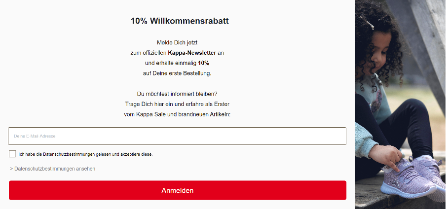
Example: In the Kappa Shop you immediately understand the benefits of subscribing to the newsletter.
Transparency
State clearly what you need the data for. Is the download of a white paper perhaps linked to a newsletter subscription or do you pass the information on to third parties? Then write that above or below the form.
Advantages
People are becoming increasingly wary of having to provide personal information such as name and email address. Therefore, mention the advantages of entering data, for example: “You will receive our free newsletter with insider tips twice a week” or “By registering you can shop faster in our online shop”.
Minimalism
Only query as much data as is absolutely necessary at the moment. For a newsletter, the e-mail address is usually sufficient, possibly supplemented by the first and last name. And for a B2B white paper download that is to be used for lead nurturing, first and last name, email address and company name are sufficient.
If you request too much data, this could potentially violate the data minimization mandated by the GDPR (General Data Protection Regulation), which applies throughout Europe!
Ask for more
If you would like to find out more about the registered users, you can ask for further information after filling out an input form. For example, send an email that refers to an extended form.
Required fields
If you do not want to reduce the number of fields, you should divide them into mandatory fields and optional fields. It is common practice to mark mandatory fields with a star. You have to explain what the star means at the top or bottom of the form.
Split
Another way to query information in a user-friendly way is to divide it into several steps. For example, use step 1 for the mandatory fields and step 2 for optional data.
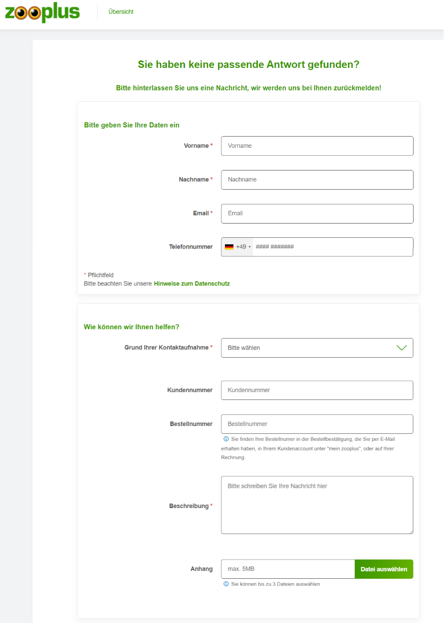
Anyone who has a question at Zooplus must first provide some relevant information.
“Accompaniment”
If you divide your form into several steps, you should clearly mark this. Show where the users are on their “journey” with names such as “Login: Step 1 / 3” or with graphic elements.
Call to action
Name the button that users use to submit their entries attractively and appropriately. Don’t write “Submit” or “Continue”, but use a call to action like “Become a member now” or “Create a customer account”.
Social-Login
Most people already have dozens of accounts with email providers or social media platforms. Use this to simplify registration: for example, offer a log-in via Facebook or Google.
Field size
Not every field in your form has to be the same size. Match the boxes to the contents! The street name usually requires more space than the postal code.
Drop-Down
Consider whether you can save your users from entering data in some places. If you want to know which country someone comes from, a drop-down menu with predefined countries is useful.
Feedback
Did a user provide incorrect information? Or did he forget to fill in a field? Then point it out to him, preferably highlighted in color.
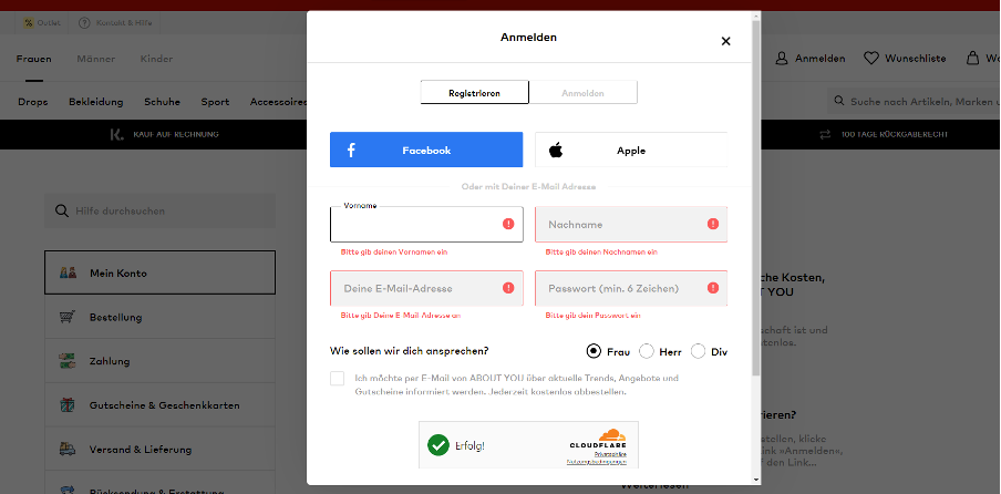
Example: If you want to create a customer account with About You and forget something or do something wrong, you will receive understandable information.
You can also give positive feedback: If a field is filled out correctly, a check mark symbol appears behind it.
CAPTCHA
Do you want to protect your company from a flood of spam? Then you can integrate a CAPTCHA to block bots. The problem is that some CAPTCHAs overwhelm people or get on their nerves. Conclusion: Use a simple technology like Google's reCAPTCHA.
Responsibility
Always check whether your form works correctly on different devices. Test whether the input masks can be used equally on small smartphone displays and large PC monitors.
Design
Each field must match the design of your website. This means: Use the same font(s) and the same colors, among other things. The overall picture must appear as if it were all of a piece. If it doesn't, you might think it's a perfidious advertising banner.
Loading times
Does the website need a few seconds to load with the input mask? Or is it just a slow process from step to step? Then you have to work on the performance! Because every second drains the patience of your online shop visitors.
Conclusion
Always be clear: Very few people want to give out their data or fill out online forms. Any point that is disturbing or suspicious - no matter how small - can lead to termination. This lowers your conversion rate.
Therefore, ensure that…
- Your input masks always appear trustworthy.
- the viewer immediately knows what to expect.
- all steps can be completed quickly and easily.
Extra tip: Run an A/B test with every customization. This means that you use the old form for half of your users and offer the revised version to the other half. Carry out this control test over a few days or weeks. Accurately measure the success or failure of your changes.


